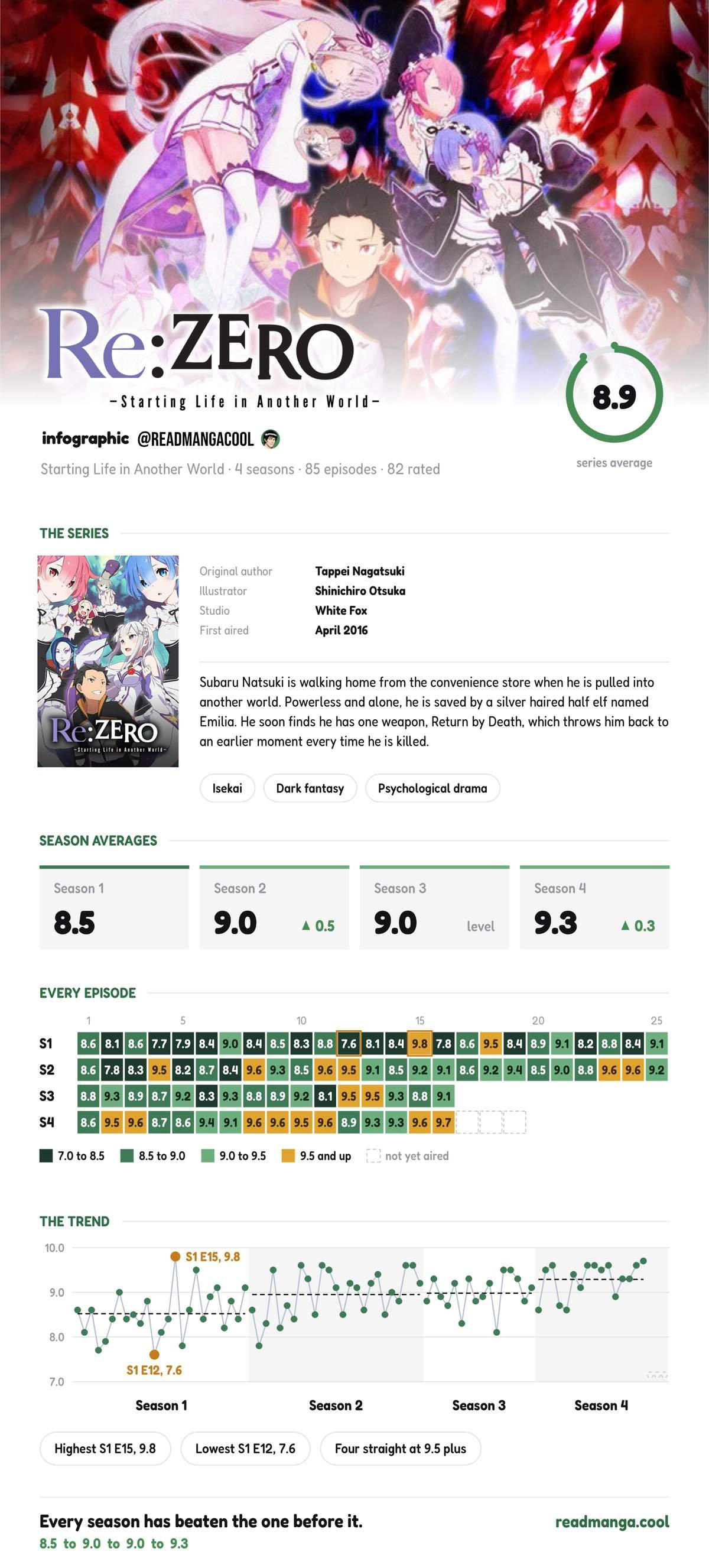
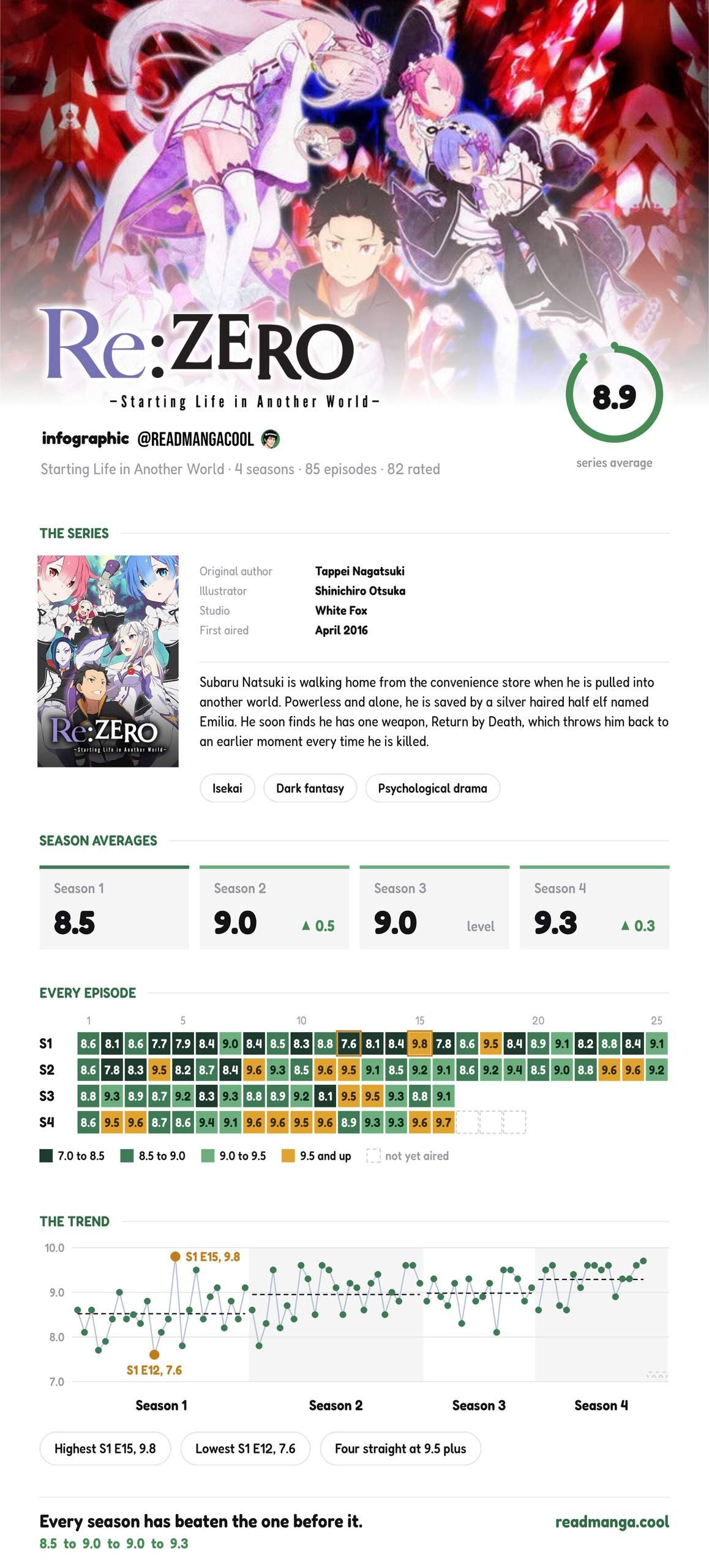
Every episode of all four seasons, scored out of 10 and colour-coded by rating
Re:zero trend graph shows how Re:ZERO’s episode ratings have changed throughout each season. Each point represents an individual episode, allowing you to see the ups and downs across the series and how the overall ratings have developed from Season 1 through to Season 4. Graphs and Ratings sourced from Seriesgraph
Every episode of Re:Zero, ranked and charted
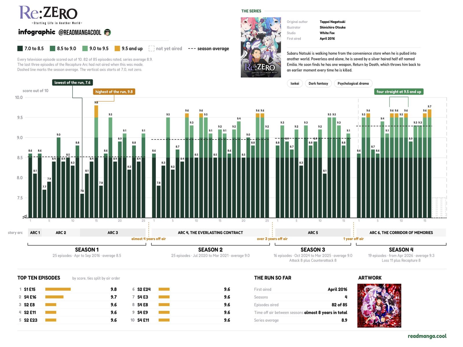
One bar per episode across all four seasons, grouped by story arc, with season averages marked
How To Read Re:Zero Trending Graph
Every episode of Re:Zero, scored out of 10.
How to read it: one bar per episode, left to right in air order. The colour bands mark score tiers, dark green at the bottom and gold for anything 9.5 and up. The dashed line in each block is that season’s average, and the grey bands underneath show which story arc each run of episodes belongs to.
Season 1: 8.5 → Season 2: 9.0 → Season 3: 9.0 → Season 4: 9.3
Best: S1 E15 (9.8). Worst: S1 E12 (7.6). Season 4 has four straight at 9.5+.
Scores are reader ratings from IMDb.
Thanks For Reading Re:Zero Trending Graph
Thanks for reading! I hope you enjoyed taking a look at the numbers and seeing how the series has developed over time. There will be plenty more graphs like the Re:zero trend graph and anime breakdowns coming soon, so keep an eye out for those. If you want to see more anime rankings and comparisons, check out the anime Tv show that composites all the scores from top review sites, where we’re building up more ways to look at your favourite anime.









Leave a Comment